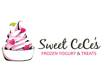
Description:
This is from the first round of comps for a new client. I drew the mark, then altered it in Photoshop and then created a final vector in Illustrator.
As seen on:
Status:
Client work
Viewed:
3917
Share:

Lets Discuss
really nice rendition of the yogurt treat! and the type works for me too. Maybe the leaf is unnecessary?
ReplyGreat job on the mark, Kelly.
ReplyNice illustration. I think you should connect the 's' in CeCe's - it would flow better. The tagline is quite thin and might be better in sans serif, coloured magenta to accent the raspberries.
ReplyWhat he %5E said. :-)
ReplyThanks everyone! I agree with your comments - I will rework and submit a new version soon. The client really liked it, and I'm waiting on her tweaks. The leaf was necessary to bring in her third color that she wanted. :)
ReplyYeh nice mark text colour would be nicer if it matched the raspberries like what Firebrand said actually
ReplyYou can always work in a third color through the advertising. I agree it distracts from a beautiful illustration and logo. Along with connecting the s, I would recommend you connect the first e to the second C as well.
ReplyI made some improvements based on your feedback. Thanks guys!
ReplyIt is great. I've always loved that font as well.
ReplyGreat job on the update, Kelly!
ReplyPlease login/signup to make a comment, registration is easy