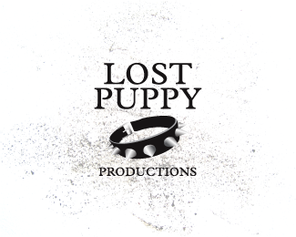
Description:
A student based, music management organisation specialising in the promotion of local bands within the Emo/Punk/Metal scene sought an image that screamed attitude. Targeted at a young demographic, inspiration for the logo came from the organisations unique name and the fashions associated with the genres of music. The collars elongated perspective and oversized metallic spikes create immediate impact, whilst a minimal colour palette of black and silver helps to reinforce its alternative appeal to the target audience. The use of a classic serif typeface was implemented to compliment but not overshadow the primary collar image.
As seen on:
Koodoz Design
Status:
Client work
Viewed:
3585
Share:



Lets Discuss
Well done Koodoz... This is top notch!
ReplyThe gradations don't look right on the spikes. Picking one light source would help. I personally think a harder, edgier font is required here as well. Changing to a san serif or a serif with better dimension would be an improvement.
ReplyPlease login/signup to make a comment, registration is easy