Description:
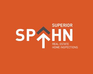
A conceptual logo.
The arrow is a central icon that symbolises forward thinking and positive results.
Secondly, the grey arrow head represents the roof of a house, marrying in with the 'Real Estate Home Inspections' tagline.
The negative space between the two arrowheads also create the triangular shape of the letter 'A'.
Status:
Unused proposal
Viewed:
6972
Share:
Lets Discuss
I like it, nice concept. I've always been a fan of arrows. **I had trouble with the connection of the A and the arrow/house symbol, though. I originally thought it was and A, but %22spahn%22 is such an unfamiliar word for me, so I had to check. The target might recognize it more, I suppose, if this group is fairly well-known. **Nicely done.
ReplyI read it correctly first time.**Nice concept and execution. It works well.
ReplyFloated this like 34 years ago but still think it's a very nice solution Marc! Did this get in use at the end?
ReplyHey Alan. Unfortunately this never got used. It was for one of those 'crowd sourcing' projects, when I was low on logo work and looking to keep the design skills up to par.
ReplyPlease login/signup to make a comment, registration is easy