Description:
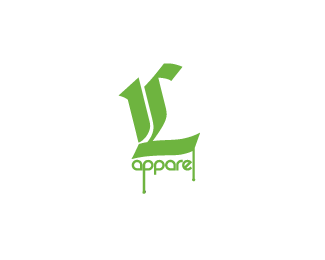
A logo designed for a clothing company represents all 3 lifestyles; Skating, Snowboarding and Surfing.
The logo uses a customised calligraphic typeface to create the symbol '1L'. The 'P' and 'L' in apparel, also have paint dripping from their character shape, to add a bit of 'street cred'. Green was utilised to represent life. This logo NEEDS critiquing!
Status:
Unused proposal
Viewed:
5782
Share:

Lets Discuss
isn't the dripping spray-paint look getting old? I know it's supposed to be trendy, but the problem with trendy is that it get outdated really fast. (I'm too old to know these things, it just seems like kids have such a short attention span for thinking anything is cool!)**...maybe if it looked more like a stencil? with the logo in green w/a black box around it, and overspray outside the box?*kinda sorta like this:*http://photos12.flickr.com/17306214_5c4bbd425f_m.jpg*http://newsimg.bbc.co.uk/media/images/42430000/gif/_42430484_graffiti203.gif*(best ones I could find quickly)
ReplyI know exactly what you are saying Amy. I'll have a go at your suggestion. Re your examples... I'm from Melbourne which is THE 'Stencil Capital' of the world, so I have plenty of inspiration to work from. If I think I can come up with something worth while, I'll post it up. Thanks for the feedback.
ReplyPlease login/signup to make a comment, registration is easy