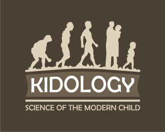
Description:
Kidology is a event management company offering specialised services for children, we tried to make this logo say : "children are important" and such we used the human evolution in the logo, placing the baby at the final position.
Status:
Nothing set
Viewed:
2258
Share:
Lets Discuss
no comments ? c'mon...
Replymmmh, I don't know if it give the right message about the care for the child.. The idea is good but you risk that when you see fast this logo you don't understand immediatly the care for the children.*
ReplyI agree with Golden.
Replyso ... the logo isnt trying to underline the care for a child, its trying to say that children are very important as to be given a party.
Replythe company doesnt provide child care services it provides lets say party services for children
ReplyIf this be the case the child should in all actuality be in the first position.
Replyhow can this be the case when the whole idea of the logo is to portray the human evolution from the cave man to the present baby, so it all started from the hunchbacked cave man to the baby ... thats the whole idea
Replyremember your anatomy or whatever lessons in which you were presented the human evolution*caveman bla bla bla ... this is the idea.... 5 stances of the human evolution with 2 character changes the woman and the baby
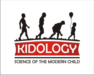
Replyi posted the negative , with a little added piece... the baloon adding i hope the party element in the logo
ReplyThe tagline contradicts the image you are presenting. I agree this is a stretch.
Replythe tag line is there just not to be missing ... its not the final tagline
Replythe first tag line was in romanian as its a romanian based company -- - your kids science ( kid ology - bio logy )... the tag line is there just not to be missing ... its not the final tagline
Replyi decided to remove the balloon as it is problematic when printing at a small scale
Replyanyway how does teaching parents about their kids sound ?
Replyyou think taglines like...are ?
Replyi think it does ...
ReplyI agree with the others. The idea is clever and it's been executed very well, but it's just an odd idea. Also, the man evolving into a pregnant woman weirds me out. Too weird to work in my opinion. What's it look like in color?
Replyim working on changing the freaking part out ... instead of using the man followed by the pregnant woman ill be using ... u'll see in a few minutes*
Replyim trying to change the pregnat woman to a couple embracing*my main concern now is : should i use 5 characters like now or 6 as if i change the man to a couple i get 6 characters... all the evolution pictures present 5 human stances*
Replymy thoughts exactly...thx for the crits... ill se about that balloon ill see anyway ill have one more version of a kidology logo online soon*
Replyi think you should get rid of the women completely %26 have it starting with the 'upright' man.. then slightly hunched back.. %26 so on (basically reverse the darwin process) %26 have it end with a kid holding a balloon... as it is.. the woman completely breaks the flow of the 'evolution' process (in this concept ladies lol.. in this concept!)
Replywouldnt that be somewhat weird considering that the main ideea is to place the baby at the top of the human evoltuion...*ill have to pass on that but thx for the opinion anyways...
Replynot really weird.. as it could be saying lets get back to the 'child within' as that is when we can truly appreciate... after all your target audience here are adults.. though the market may be for kids... anyway.. just a thought...
Replytrue...*
Replynido do you have a messenger id ?*
Reply[email protected]
ReplyPlease login/signup to make a comment, registration is easy