Float
(Floaters:
0 )
Description:
this logo is a product of my brain dump for school.
Status:
Student work
Viewed:
760
Share:


Lets Discuss
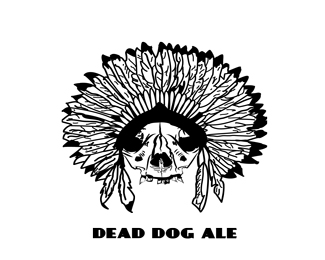
I think you over designed this way to much. I like the details, but there is just to much going on. I would have liked to see less feathers and not a lot of detail.
ReplyMy concern about this is it won't really translate at smaller sizes.
Replydetail overkill much? this would be an awesome work of art, but as a logo this would be just a pixellated nightmare, especially on something small like a phone card. I agree with Bryan on this one, lose some of the details in it and it should be much better.
ReplyPlease login/signup to make a comment, registration is easy