Description:
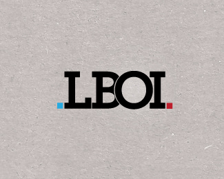
Our branding is finally complete. This is the final logo for LBOI. This logo has a personal connotation to us. We wanted it really simple. Custom Type.
Website is underway.
As seen on:
LBOI
Status:
Nothing set
Viewed:
1879
Share:


Lets Discuss
The blu dot is a bit hard to see on this background, otherwise looks nice.
ReplyThanks Lecart :)
ReplyLooks good to me lboi. Congratulations!
ReplyThanks Chad :) I appreciate it!
ReplyThe hairline separation could arguably be removed as at nearly any lesser size it will be invisible.
Replyvery classy
Replysweet... is the type ITC Lubalin Graph?
ReplyThanks guys.**John, the type is made out of custom shapes, inspired by the Archer typeface. :)
ReplyI agree with dache. Try taking the stroke off of %22O%22 and let the letters bleed onto one another. Everything is so bold that the thin line is a distraction.
ReplyOK, I guess I'll be the one... Hm, hm, hm... You know that we're good Sneh, right? We go way back and please get this as constructive criticism...*I don't see nothing original here and I know that YOU have the power and experience to make it better. First of all, we all know what LBOI stands here and despite the really cool background for making some nasty Pandora stuff here, you went the rounded way with some serifs and two dots that share really awkward positions. This is very confusing. The color scheme, the concept, the story, everything seems off here to me, especially, to say it again, when I know what does LBOI stand for! I don't feel it at all Sneh, sorry... :(
ReplyThat's cool Alen :). Constructive criticism noted.
ReplyCan I ask where is the owl, cuz I read about it somewhere, when you were saying something about that, but I can't find it in this logo... (?)
Replyyeah, obviously, but it looks like a fat owl :P Have the B cut into the O, and there's the smart owl, haha. don't mind me.
ReplyDamn, sorry. Too obvious it was... but still no owl for my eye. Guess I'm blind, or something.
Reply@Lecart Fat Owl lol. That is funny and quite right too :). The owl has since then garnered some motivation to get rid of his Buddha belly and is happy to say that he is quite trim now.**@milou thats cool .. it is not meant to be obvious at all .. just something put in there for no greater purpose, only to humor ourselves, we are quirky like that. :)**@AnthonyLane thanks for showing the way :)
ReplyPlease login/signup to make a comment, registration is easy