Description:
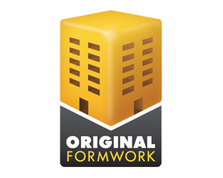
Just a simple logo for my brother's business. I'm not keen on the font or the placement of the text. Without touching the yellow building too much, how else could I have placed the text? Any ideas?
As seen on:
originalformwork.co.uk
Status:
Nothing set
Viewed:
1577
Share:


Lets Discuss
I don't think it's a shadow.
ReplyNo, its not a shadow. I saw it more as a road or the ground.**I didn't know what to do with the text, so I just continued the shape of the building further down onto the ground and placed the text on it. So its part of the ground cut from the sides to be in line with the building, but yes it looks more like a wrongly placed shadow.**I'd actually prefer not to have it there, but I don't know where to place or how to style that text around the building.
ReplyPlease login/signup to make a comment, registration is easy