Description:
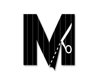
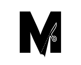
I took some of the fine tuning advice and made some more modifications. Refinement 4.
Status:
Nothing set
Viewed:
4200
Share:


Lets Discuss
I like it but I think the flap could be a shade of the black as if the light source was on the left. I also think the scissors would look better reversed out and the line weight on the dotted line could be the thickness of the line around the scissors here.
ReplyLooking even better Leighton - I second all the comments that Bart has made above ...
ReplyVery nice - I don't know if the gray line around the scissors is really necessary though. But it's looking good!
ReplyCouple quick nit-picky things. I don't think you need the left scissor edge to show. That area should be flush with the cut. Also, the grey outline around the scissors is not necessary. If it was just the negative space, it would look better in my opinion. Also, what if you cut the lines out of the 'M' as opposed to just having the stroked lines on top? For presentation, this will also look better. Just a couple of things. Love your work, Leighton!!
ReplyAlright, I made some little refinements. Please take a look.**I like the gray lines on top of the 'M' as they make the material look like pinstripe trousers and a more upscale feel.**admarcbart, Ocularlink and drewboy- Thanks for the latest feedback, it's a lot further refined than I thought it would be and feels more complete.
ReplyGreat feedback. Looks perfect now.
ReplyThis is really good now Leighton! My only quibble (and I'm getting pretty anal retentive now) is the first 'half dash' at the lower point of the 'M': I would try to make it a full dash like the others, starting right on the edge of the 'M'. You've got a brilliant mark here - I like it a lot.
ReplyIt looks great. You're a champ!!
ReplyThanks for your help. I appreciate it.
ReplyNeeds a little bit more fine tuning! I would also get rid of the drop shadow, and maybe make the dotted line a bit thiner! Lovely idea though!
ReplyThe shadow works well - it gives an impression of cloth on a cutting table. Shadows are often overused, but I think here it's justified. The dotted line was thinner in previous versions, I think Bart mentioned thickening it up early on... so that the mark could be used on stitched labels without losing the detail, if memory serves.
ReplyOh man, I am coming into this awfully late, but... my two tiny quibbles are that the dotted line is a bit too fat and where it runs into the scissors, it makes the scissors look broke. Thin the line and move the scissors down a little in my opinion. Sucks when people really like a mark they wish they had thought of, the tweaking ideas get a little crazy, eh?
ReplyThe interesting thing is with all the tweaking and suggestions to this design, the original version is still more popular on this site. Don't know what that's telling anyone%3B)
ReplyDesign by committee! Even a well intentioned, experienced and highly creative committee, but still a committee!
ReplyPlease login/signup to make a comment, registration is easy