Float
(Floaters:
13 )
Description:
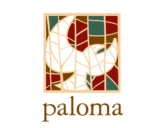
Proposed logo for a real estate development with Spanish architectural influences.
Status:
Nothing set
Viewed:
4180
Share:





Lets Discuss
very nice work on the mark!
ReplyNice mosaic effect and colours. The p looks like a different font.
ReplyThe 'p' is Garamond just like the others. Nothing customized there.
ReplyMmmmmmm..nice. I really like this mark. The lonely %22l%22 ascender bugs me a bit but this thing is a beauty.
Replythumbs up!
ReplyPlease login/signup to make a comment, registration is easy