Float
(Floaters:
2 )
Description:
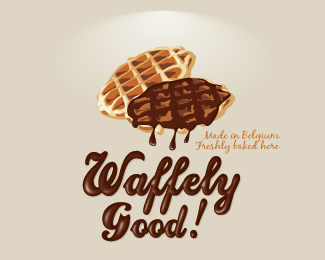
Proposition de logo pour une franchise de vente de gaufres belges en Irlande.
Status:
Unused proposal
Viewed:
4796
Share:


Lets Discuss
I like a lot the treatment. Is it vectorial?
ReplyPS. Welcome to Pond. :)
ReplyHello tass,*Thanks for comment and welcome :)*Yes, it is completely vector.
Replythx for your opinion radhacelis :)
ReplyMaybe I should have put it in vector illustration…
ReplyThose waffles look really good. I agree with the mentioned complicated issues with this design. It takes away from the logo being versatile or used on different mediums.
ReplyIt's a pretty nice illustrative logo. A couple of thoughts though: There seems to be a disconnect between the waffles and the type. On the waffles, you have flat shapes and colors to create depth, while on the type, you're using gradients. Perhaps do away with the gradients on the type. Also, at this size, the subtext is barely legible. You might try having %22Waffely Good%22 on one line with the subtext underneath and larger.
ReplyI completely agree with you Ocularlink. Every remark you made is right. It's a pretty good analysis ! :)*Thanks for comments too Iumo and vintage_chic.
ReplyPlease login/signup to make a comment, registration is easy