Description:
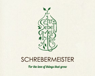
Logo design for a Viennese company specialising in designing and creating bottle gardens. Hand-drawn.
As seen on:
Limeshot Branding Sydney
Status:
Work in progress
Viewed:
4061
Share:



Lets Discuss
This is outstanding. The characters resemble foliage perfectly. It feels very ethereal. Nice job. I think the company name at the bottom is dominating your beautiful bottle mark. I'd opt for a type face that matches.
Replyyep ... this one is special ...
ReplyThanks Nick! Look, I'm not even convinced it needs type at all. It's just a possibility I'm contemplating. However, you're right, a nice serif font would be less harsh.
Replywow, this is impressive!
ReplyNice work! Veeeeeery Beautiful!
ReplyVery special, so tender graphics..
ReplyNice, beautiful designer and design
ReplyOne of my faves of yours.
ReplyPlease login/signup to make a comment, registration is easy