Float
(Floaters:
9 )
Description:
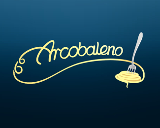
edit2: Ok, so we got first A in uppercase. I think it's finally readable correct.
Status:
Nothing set
Viewed:
1664
Share:


Lets Discuss
I love this mark, the only thing is the A and r is a bit difficult to read. Otherwise this is a beautiful mark. Maybe add a tiny bit more negative space inside the fork too, it'll help define it a bit more.
ReplyThe noodle (?) makes a C before a so that it reads 'Carcobaleno'! The noodle can be attached to the serif of 'a', instead. Just a thought!
Replythanks. It's first draw and comments are very helpful.
Replyvery nice sign, it's true that some can read Carcobaleno but i have no idea how it could be made more readable
ReplyNice work, but It's C again... Hmm ::::: Try to use capital A and lenghten middle stroke of an %22A%22 to connect with spaghetti, but keep this big curve and push it a little bit down, maybe... Don't loose this flow! Hope you understand... ? **--A**
ReplyOr maybe the capital A has a long descender on the left that doubles back? Otherwise, good work, and good luck!
ReplyYes man, everything is fine now... Readable and smooth, very nice logotype ! *:)
ReplyPerfect! Kudos, liquor.
ReplyThis is nit picky... Love the improvements, but the blue lines on the far left of the spaghetti are unlike any other overlapping techniques you've used elsewhere.... I'd either just take the split out or the two curlies all together.
ReplyPlease login/signup to make a comment, registration is easy