Float
(Floaters:
63 )
Description:
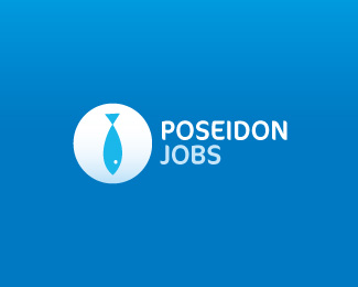
Proposed concept for new online job board targeted towards mariners and alike
Status:
Unused proposal
Viewed:
25134
Share:

Lets Discuss
Nice, I like the simplicity of the fish. Looks good!
Replyfish is a tie, nice
Replyi can see a fat guy also :)
Reply:) Well, if you lower the magnification of that monocular, you'll see he's not fat - rather well muscled, like true mariner should be :)
ReplyNice kipper tie, Bojan!
Replyhehe cool...
ReplyMarvelous concept, Bojan!
ReplyClever, but the fish is too obvious. Fish typically associates with a smell and other things that don't relate well to what's being implied by the name and the tie. I'd try getting rid of the eye and see if it still works.
ReplyIf fish is associated to smell with this target group, than they're in wrong business :) it's everywhere around them :) Eye is a fine touch - look at it as a button tie :)
Replyfricken sweet, faved floated, nice job bojan
Reply%3E it's everywhere around them :)**OOoh, very cool then :-)
Replyvery good. wordmark is too(i dont like B). i think you should try to upper the body of the fish. *the intersection of body and tail might look good if intersected.
ReplyLOVE this simple solution! Awesome bojan!
Replyand fish smells good and swims good in that blue:)
Replyclever !
Replybrilaint
ReplyGreat concept!
Replyv.cool
Replybig fish %3B)
Replyvery clever :)
ReplySuper concept! :-)
ReplyLooks too much like a fish ora tie, I can't decide which? %3B-)
ReplyI like the font you used!
ReplyFF Cocon, I suppose. Has a nice watery feel
Reply%5E indeed
ReplyHooked me for sure...very nice bro:)
ReplyThanks Mister Jones for the info about the font, I find the %22light%22 of Cocon very very nice. I don't like the bold ones though
ReplyWoah! Thanks again!
Replythe %22tie-fish%22 rules! :D%0D*sounds like a chines food :P
ReplyGood job.
ReplyOMG, I am DYING to see the circle turn into a white shirt icon and see if the fish works as a tie! You know, to go to the interview in!
ReplyGreat concept and nice play with the tie and fish it works
ReplyThanks guys. At the end my other concept got a chance to represent this company, hence this one is going through ye ol' recycle phase :)
ReplyNicely done!
ReplyIt's simple yet I love the fact that it doesn't go around the bush... I love straight forward messages... sometimes we don't need the subliminal stuff ! Great job. I once did a logo for a %3Ca rel%3D%22follow%22 href%3D%22http://www.olx.com/advertising-jobs-public-relations-jobs-cat-266%22%3Epublic relations jobs%3C/a%3E company and I used the same strategy. Simple and efficient.
ReplySimple but perfect! I like it
ReplyPlease login/signup to make a comment, registration is easy