Description:
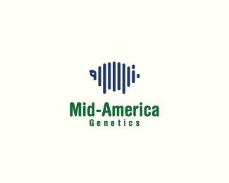
Logo for a hog genetic company. Mark consists of a hog in the form of lines from a DNA sequence.
As seen on:
golumo
Status:
Nothing set
Viewed:
3567
Share:
Lets Discuss
Cool, James.
ReplyDo you see enough pig in the mark joe?
ReplyYes sir. Saw it without the description.
ReplyGood stuff lumo. Also saw the pig before the description.
Replythanks joe and mfrank.
ReplyI think the pig is very clear too :)
ReplyHow about some light pink?
ReplyI am using the company colours exactly as they were decided: blue and green. They probably won't change.
Replyhehe)
ReplyI would try Helvetica rounded condensed for more harmony with the mark. Have you tried adding a curly tail (squarish)? I didn't see the pig like some others. Nice mark.
ReplyI did play with the tail and wanted to put in a curl. However, it's hard to do without compromising the thickness of the line and I'd like to keep it uniform. I'll play with it.
ReplyLove this concept.
ReplyI dig the pig! Am I alone in thinking the pig could be 20-25%25 larger?
ReplyPerfect! I think the sizing works with this layout, maybe the tagline down a bit and slightly bigger to line up with the pigs front and rear.
Replygreat concept %26 execution! the only one thing that bugs me a little bit is the tail, it's to tight and need some white space maybe you could work on this de%22tail%22.
ReplyI worked on the tail and added more white space. Looks better now. thanks.
ReplyLet's hope this pig flies with the decision makers!
ReplyLooking good Lumo:)
ReplyI prefer this color option, more uniqe imho
Replythanks brandsimlicity and alex. The company has decided to go forward with this concept and this colour. They loved the other one too, but felt the company philosophy and context is more suited with this colour.
Reply%5E congrats
Replythanks alex. You gotta love it when a company loves a good design.
Replyi saw a turtle.
ReplyPlease login/signup to make a comment, registration is easy