Description:
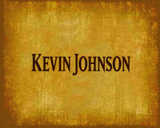
This logo is for a country singer. He wanted a non traditional approach that was edgy and a little urban mixed in.
Status:
Work in progress
Viewed:
1972
Share:


Lets Discuss
nice work, lumo:p though, do i feel that is something wrong with the 'N' letters. i think it does not match with the rest of the letters. Maybe only the last N of Johnson should be like that and the rest with normal serifs.
ReplyThanks myway. I was wondering about that too but there is something about the edginess that I like . I felt it communicated what the artist was looking for and left then this way.**Perhaps I could get a few more eyes on this one...
ReplyPlease login/signup to make a comment, registration is easy