Float
(Floaters:
33 )
Description:
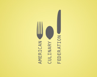
Logo redesign for the American Culinary Federation
Status:
Nothing set
Viewed:
26493
Share:


![South Georgia Immediate Care Center [6]](/logos/0fcea6b39cc0e0deddb8ba8dc8bb1331.png)
Lets Discuss
This would benefit from a heavier type weight. Nice one.
ReplyI like where this is going
ReplyBrilliant work. Love it.
ReplyRepresenting the S-C-A-D. Nice work, way to not delete this one off the gallery page, ha ha. with this logo i only wish the leading were equal, but i understand that it wouldn't work with the forms above the type, maybe if it were a butter knife! ha. no don't. looks great. keep 'er up.
ReplyI think when employing vertical type setting, you may want to explore a mono-spaced typeface - there ARE some nice ones out there! :)
Replyfeels topheavy to me- maybe try a thicker or more contdensed font. that will give you the shape on the handles you're going for. you could also taper it towards the heads of the silverware to further customize the handle shapes
ReplyI would try to make it horizontal, and remove the gradient out of the typography. Also, maybe removing the gradient anyway and using just simply and clean lines would do better. The overall idea s very good.
ReplyAgree with most of what's mentioned above:*- lose the gradient*- even out leading *- slightly bolder weight on typo*Nice mark.
ReplyThanks, everyone, for all comments and feedback!
ReplyLogo updated!
Replyshort fork?
Replylove the use of font as handles.
ReplyOhuenno!!!
ReplyGreat Work. Congrats!!!!
ReplyPlease login/signup to make a comment, registration is easy