Description:
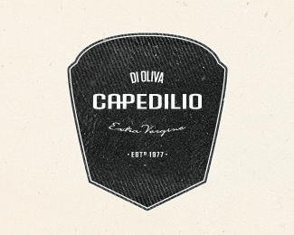
2nd take on the logo for Capedilio. I think the badge feels more balanced here. I'd love to hear some thoughts.
As seen on:
mabu.dk
Status:
Nothing set
Viewed:
5561
Share:
Lets Discuss
Awesome retro feel my friend.
ReplyGreat stuff, Mads!
ReplyThanks amigo.
ReplyLoving this!
Replylooks great mabu.
ReplyAwesome!
ReplyI like it. Not sure about the font choice or the font treatment for %22CAPEDILIO%22 though, feels too much modern for me. May be more tweakings could be added (lowering /A and P crossbar connection as you did for the /E for instance) or a different font (more condensed? more geometric/mechanical? tuscan?). Anyway, that's a fine work.
ReplyMuch appreciated gents. **Thomas: Thanks for the input man. Tuscan type would be great, but the client wanted a more clean look which could be used troughout the whole identity. So, it's actually going to be a full corporate alphabet.
ReplyDamn, too bad... A tuscan would have been fantastic... Client is King.*Luckily you did a very good job on badge and the last update with this new /AP connection works far better to me.
ReplyThanks a bunch man.
Replyfine work)
ReplyCouldn’t fault it Mabu, incredible as always.
ReplyPlease login/signup to make a comment, registration is easy