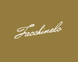
Description:
Facchinelo is a small family-owned business handed down through 3 generations. They produce finger lickin' good olives and olive oils.
As seen on:
mabu.dk
Status:
Nothing set
Viewed:
8037
Share:


Lets Discuss
2nd take on the Facchinelo logotype. I'd love to hear some thoughts.
ReplyVery nice. I prefer this one, mainly for legibility reasons. I feel this baby needs a little more randomness in the baseline or a swash into the descender line somewhere, maybe on the %22n%22 or the %22l%22.
ReplyAgree with Julian. Overall very appealing.
ReplyTo be honest I like this the way it is. I'm loving your typography works.
ReplyI like it, still it seems to me the text isn't on a perfect line, it's somehow bended upwards. Do you know what I mean? I think the %22i%22 is the problem, seems to be a bit smaller.
Reply%5E Agreed, the i and n in down part seems little odd regarding to the rest.
ReplyI agree with everyone here. I'm sure you will take a look and solve this. Great logo and showcase, Mads.
Replycongrats on the gallery spot. well deserved.*and great showcase man! just keep up the good work.
Replygood one, Mabu!
Replyneed some work on lines. but it%3Bs lovely either way
Replygreat work, Mabu! andreiu may have a point here, but it looks great anyway:p
Replyterrific type work. great stuff here and in your showcase.
ReplyThanks a bunch for the kind words and feedback everyone. I've revised the issues on the /i/ and /n/.
ReplyLovely type work!
ReplyGreat type Mads!
ReplyCheers Michael and epicantus.
Replystaring at it for almost two glass of coke and i cant find the downside. Simply beautiful, mabu..
ReplyPlease login/signup to make a comment, registration is easy