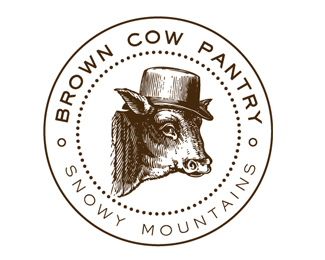
Description:
Logo designed for a food products company in Australia that did not pay in full for the work. Enjoy it anyway!
Status:
Client work
Viewed:
11129
Share:
Lets Discuss
I love the 'did not pay in full' addition to the description! A classy logo for a less-than-classy client.
Replymadefresh, sorry to hear about the client, they are lucky to have received an excellent logo.
ReplyGreat cow illustration! Nice logo! Congratulation!
Replyloooove it! :D
ReplyI'd say that logomark really....'moooooooves' me... %3B) LOL. Seriously, tho, it's rare nowadays that a classic/traditional look is used. Love it! Wish more were out there like this one.
ReplyYou really captured that cow's good side. She looks happy and a pinch bashful! Nice work.
ReplyYes, madefresh, I love seeing what I can never do. Nice logo!**On a side note, David (site owner) you really need to get an icon for %22client did not pay in full%22**I imagine it would be used a lot LOL
ReplyNice work... would look great branded on a cow :)
Replyhaha love it! (and not just because there's a cow in there) :)**very cool expression on the cow - impressed.
ReplyLove the expression, and the the look n feel.
Reply%22On a side note, David (site owner) you really need to get an icon for %22client did not pay in full%22**I second that. Great logo, Yael.
ReplyLove this logo. What type face did you use?
ReplyEngravers Gothic :)
ReplyPlease login/signup to make a comment, registration is easy