Description:
halo spa color
Status:
Student work
Viewed:
616
Tags:
mary jo
•
mary jo
Share:


Lets Discuss
mallen58,
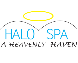
ReplyI don\'t know if I should like this logo or think of it as a perversion. I had to be so blunt/bold but when it comes to logo design you have to look at the logo/design from all viewpoints. The overall logo has a light feeling (a spa logo should be light) but the font that \"a heavenly haven\" is in just doesn\'t work with the logo. I feel that you have two many things going on with the logo (too many elements). The Halo and the mountains (hills). There is also too much of a division within the logo.
i like the three different versions of your design. if it was me i would go with the halo and type it seems more clean and less complicated.
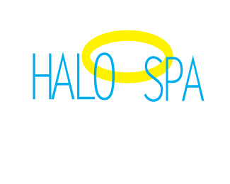
ReplyI really like your second draft in color. The words Halo Spas covered by the halo is much simpler. I would like to suggest applying a possible outline to the yellow halo. A heavier stroke on one side and a lighter stroke on the other.
ReplyPlease login/signup to make a comment, registration is easy