

Description:
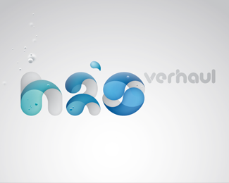
I've had the great pleasure working for jovoto NY making a logo for the project H2Overhaul. jovoto wanted three suggestions for a typographical logo. At least one of the suggestions should have the O in H2O shaped like a water drop.
H2Overhaul held a competition on the jovoto platform in October 2011 looking for ideas which explored how new and existing buildings/facilities could use less water, reuse the water they currently use, and capture water to use on-site.
Status:
Unused proposal
Viewed:
14529
Tags:
grønlund
•
blue
•
h2o
•
water
Share:

Lets Discuss
I think it's really nice =) great job
ReplyXcellent work here ... thanks for sharing !
ReplyPlease login/signup to make a comment, registration is easy