Description:
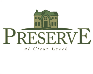
Logo for a housing development. Wanted to have an illustrated house, and hills to go with the region.
Status:
Nothing set
Viewed:
1340
Share:
Lets Discuss
This is good, but I thin you can make do without the outline for the type :)
ReplyThanks for that. I'm also thinking of dropping the size of %22at Clear Creek%22 a few points.
ReplyI like it. I'm just not sure that I would have noticed the hills if you didn't mention them. You may want to think about reworking them. The font matches the illustration style superbly. Nice work man… or woman (I don't know)
Replyjrt1223: First, I'm a guy :) Name's Eddie. Second...**Someone else commented to me about the hills. I see what you mean. They need to easily be hills.**Thanks
ReplyNice illustration but the colours should be more welcoming. The title case gives the illusion that the E is bigger than the P. Hope this helps.
ReplyPlease login/signup to make a comment, registration is easy