Description:
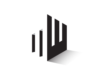
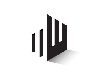
The logo features a negative space resembling the two letter MW.
Status:
Client work
Viewed:
16336
Tags:
factory
•
marx
•
extraordinary
•
intelligent
Share:

Lets Discuss
Cool concept! Do you have a version without the grey triangles? I think it might be more effective as solid black.
Reply@kylernezin Thanks for appreciation and suggestion. We have a version with solid black also. submitted the black version please check..
ReplyI think that's definitely more effective. Have you tried using a light gray instead of white for the "M"? As of right now it blends into the background and doesn't read "M" right away.
ReplyYour 2 point perspective is not quite right. It is throwing the design off IMO
ReplyThe perspective might be fine, maybe it looks weird because the 'inside' areas of the M are not casting a shadow on the ground?
ReplyHi Marxfactory!, I would like more information about this logo. Do you have any email and phone where I can contact you?
ReplyPlease login/signup to make a comment, registration is easy