Float
(Floaters:
31 )
Description:
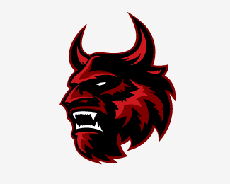
Just messing around with an idea... feel free to comment or critique.
Status:
Nothing set
Viewed:
20433
Share:





Lets Discuss
something about the eye is off. %0D*I get the feeling he is looking behind him some how.%0D*But very cool.
Replyyeah the blur is a little random...%26 it does look like he's looking over the back of his shoulder...**apart from that, it's a great look :)
ReplyLove the illustration style but not the blur.
ReplyI like the perspective on the face, it makes it look more like he's growling, I think. like it's caught mid-action.
ReplyYes, you've done it!**Keep up the good work. A big improvement over the existing NJ Devils logo.**Only consideration, it may be too intricate to be seen clearly from a distance or seen on TV.**(I'm also a NJ Devils fan)
ReplyCan't go wrong with a good devil head. Solid illustration. Now you need to go find a sports team called The Satans and cash in.
Replygreat brand **i love it !
Replyamazin
ReplyBeauty –if it didn't look like the Beast.
ReplyBeauty -if it didn't look like the Beast.
ReplyCan I use this on a jersey concept I am making. I'll be sure to give credit
ReplyPlease login/signup to make a comment, registration is easy