
Description:
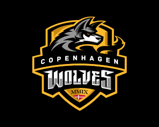
Pro basketball team in Denmark... Was able to give my old Bruins concept a face lift and they were thrilled with the result...
As seen on:
Status:
Client work
Viewed:
23663
Share:





Lets Discuss
I can see why. Lovely use of light and shade.
Reply'Kick ass' work.
ReplyCan i float this twice David? Please?
ReplyAmazing work.
Replyawesome job, very sweet logo!
ReplyAnother impressive masterpiece
Replyhaha, many thanks.
Replyreally love the style and blue shades used!
ReplySo strong - fantastic sports logo.
ReplyGreat execution!
Replyyes great sports logo indeed
Replythis is stunning. A master of your craft my friend!
Replyvery nice
Replyit's great! i love your works.)
Replyanother great bear :)
Replythank you all for the kind words!
ReplyExcellent work! :)
ReplyOne of my favourite sportslogos. The team is from my country, and the logo-standard in the league is very low, so nice to see some refreshment :D Good job.
Replyfantastic work... this is the kind of quality needs to be on the home page...
Replylove. love. love. this.
Replythanks. love your portfolio yelds.
ReplyMan I really enjoy all your work! I'm more of a fan of sports logos than the actual sports they represent. Your collection is an inspiration. Makes me want to work harder at learning more Illustrator techniques. Do you scan in a drawing first then work over it? Do you create type from scratch or do you manipulate a type face and tweak it for a specific look?
ReplyI really like some of your logos... can we do business? first time on this site , not sure how to contact you, if you could contact me , that would be awesome!
ReplyJerry Dickson 780-628-2261
Nice work Bakken...really love the color scheme, the type and how everything works really well together. Floated / Saved.
ReplyPlease login/signup to make a comment, registration is easy