Description:
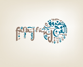
This is an initiative established to help out and support families who lost their main source of income (Husband, father, sun, brother). Its more concentrated on those who went to prison and left their families without financial support. So while those are in prison, Faraj Fund takes care of their families.
The meaning of «faraj» is «relief», it has more meaning in Arabic context, thats why it might sound odd :)
The overall shape of the mark conveys a key, which supports the concept of (MOFTAH AL FARAJ) which means (The Key of Relief). Arabs can relate to the expression. Its the key to solve the problem.
The MIXTURE of the two typefaces is to reflect the UNITY of the society in all levels and aspects in taking out an effort to SOLVE THE PROBLEM in hand (prisoners families). Doing so, the whole society becomes ONE.
Having the over all shape as a Key gives the viewer vibes that are related to (ACTIONS), which mainly circles around taking INITIATIVE. So its INVITING.
Style wise, the shape supports the targeted group slice in terms of it being mainly focussed on people living in UAE, Arabs, Muslim Arabs, None Arab Muslims and foreigners. And they can relate to the subject of the initiative.
Status:
Work in progress
Viewed:
3221
Share:
Lets Discuss
I don't know the first thing about Arabic typography but this looks good to me!
ReplyI know it could be a bit confusing :)*thanx for dropping by and for your comment megashred**CHEERS
Reply*facepalm**Now I see there's actually English text here. I missed it the first time, but I still think this is a cool logo.
ReplyPlease login/signup to make a comment, registration is easy