Description:
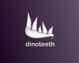
I did a couple of trials of this one and I really need your opinion on this. its a fossil research center. CHEERS
Status:
Nothing set
Viewed:
1009
Share:


Lets Discuss
hmmm........I can say I like the font choice depending on the target audience. It seems kinda kid like with the rounded ends. So if it is aimed towards kids then you are ont he right track. Now the mark I think needs some polishing. Maybe start with a less embellished dino head and scale back from there. I am thinking this could be a good candidate for a wordmark. But maybe a little more info about the industry could give more clarity and your decision to go this route. Thus helping us make suggestions.
Replyddd, I just want to say that I really enjoy your critiques, they are really helpful :).**About the font, am with you 100%25 on the kidish feel, but sure the audience are not kids :) , so I guess am gonna have to investigate more to solve his issue. maybe a serif font like TRAJAN could give it a more serious and scientific look and feel.**About the mark, I was actually trying not to go to the obvious like dino head with the teeth, thats why I went with just the teeth. but am with you on polishing the mark :).**This center is actually in search for new dino remains and fossils in new areas.*they will be active all over the world but they are still new and in need of a good image. They actually liked the name, coz it different and modern when it reads.**We didn't get a good portion of info or strong insights that can help us developing a 100%25 meaningful mark, thats why am depending on the name to create the mark.**OH MY GOD I talk toooo much looooool :)***CHEERS
Replywell, dont change the font yet. It could be brought together splendidly with a the right mark. Maybe go the route of a tooth with a bit of abstraction. Like a random shaped rock with a tooth inside. I know it is a bit precise but sometimes that is the best road or maybe the road of less resistance.**good luck and update us.
Replybtw, I am glad someone likes what I write. A lot of time I dont agree with the masses. And I get beat up or ignored for it. But I figure we are not here to have our egos stroked.
Replybtw, I am glad someone likes what I write. A lot of time I dont agree with the masses. And I get beat up or ignored for it. But I figure we are not here to have our egos stroked.**dammit, it replaced what I just wrote with the above comment....grrrrr.**Well basically I said:*Dont change the font as of yet. And maybe try something a lil abstract mixed with precision. Like a random rock-like shape with a tooth inside (hint fossil). I normally get my obvious ideas out there on paper then look for ways to abstract them a bit. But sometimes the route of less resistance is the way to go.**good luck and keep us updated.
Replyyou got that right bro, and me too.. it happens that when i see somthing that needs to be fixed for the sake of making it better..i get either ignored or shooshed!! but i always talk nicely and we are here to actaully learn and correct not to show muscle, right?%0D*%0D*man i would love to have you commenting on my work coz really you hit the point, and you notice the things that matter :) , thanx again and i'll some amends and post it soon and will wait for your comments :)%0D*%0D*%0D*CHEERS
Replyi 4got to tell u that i have already an execution were am using just one tooth :) just like you said, i will post it tomorrow.%0D*%0D*CHEERS mate
ReplyPlease login/signup to make a comment, registration is easy