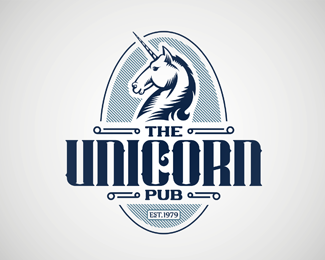
Description:
First sample:
http://logopond.com/gallery/detail/189125
As seen on:
Behance
Status:
Work in progress
Viewed:
4612
Tags:
canada
•
calgary
•
pub
•
unicorn
Share:

Lets Discuss
This is really nice. I love the type. The only thing that bothers me is the way the unicorn is facing. Since we read left to right having the unicorn facing left makes it fight with the flow of the type imo. Maybe it's just me though.
ReplyPlease login/signup to make a comment, registration is easy