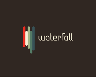
WATERFALL
by michaelspitz • Uploaded: Apr. 19 '10
Float
(Floaters:
59 )
Description:
Experimental mark exploration.
Status:
Just for fun
Viewed:
8,134
Share:



Lets Discuss
Interesting, love the color combo here.
Reply@mcguire design - Thanks a lot!%3Cbr%3EI played around with it for a good long while until I was happy with it... %3B)
Reply**UPDATED***Rounded out the type %26 corrected some kerning issues...
ReplyGreat work Michael : )
Reply@matjak - Thanks a lot Matt! :)
ReplyJumping in with mcguire design to say I really love the colour scheme. I'm quite fussy about colour%3B playing around with it for a while was definitely worth it here!*
ReplyNot liking the type, but the mark is outstanding.
Reply@clairec - Thanks a lot Claire! Time well spent then... Cheers!**@epsilon - Thanks buddy! But hmm...I've had nothing but positive feedback on the type thus far. As a matter of fact, I'm actually developing a font based on it right this moment...
ReplyI meant that I wasn't liking it in combination with the mark. Mark is abstract and minimalistic, and the type is on the fancy side. IMO they don't match.
Reply@epsilon - Aha...I see what you mean. Thanks for clarifying :) I can see where you're coming from with the contrast againt the ultra minimal. Perhaps the type on this guy warrants a bit more thinking... In any case, thanks again for the comment on the mark! :)****UPDATE***So it must seem like I'm on a bit of a type kick lately...but these guy's have been sitting on the back burner for a couple weeks now...**In the meanwhile I've been playing around with the current type trying to develop the set... Again is a (WIP) but if anyone wants to give it a look? %3B)*%3Ca href%3D%22http://www.flickr.com/photos/michael-spitz/4576368425/%22%3E**WATERFALL TYPEFACE**%3C/a%3E
Reply%5EI think that link was off...*Again %3E %3Ca href%3D%22http://www.flickr.com/photos/michael-spitz/4576368425/%22%3E**Waterfall Typeface**%3C/a%3E
ReplyGreat work, you know I love the type! Nice colours too. And I much prefer the flat mark to the shadowed version.
Reply@Gafyn - Cheers my man! Thanks a lot! I actually prefer the flat version as well %3E true to color. Really, the shadowed version was more of an experiment than anything else %3B)
ReplyReally really nice work!
Reply@oski - Thanks so much! :)
ReplyWow Michael! Very nice piece of work!**Outstanding mark. **Seeing your gallery and loving it!**Cheers!
Reply@BrunoDF - Thanks so much Bruno! I really appreciate it!
Replyloving this. preferred version.
Reply@vergad - Much appreciated Matt!
ReplyPlease login/signup to make a comment, registration is easy