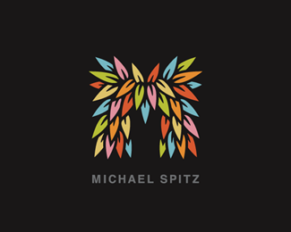
Description:
Personal Branding
(Distilled mark for scale applications)
>FULL IDENTITY SET: HERE
Copyright © 2010 Michael Spitz
All rights reserved.
Status:
Client work
Viewed:
21811
Share:


Lets Discuss
looks great at this stripped back scaled version. classic!
Reply@mcdseven - Awesome!%3Cbr%3EIt was kind of a trick fit... But that's the thing about 'plants' %3E they're quite often fractals to begin with... %3B) Thanks a lot!**@thisGuy - Cheers! Thanks again! :)
Replyae, this really good!
Reply@myerohov - Thanks a lot! :)
Replyi event think i like this one more than the big one.
ReplyThis is even better! Love it. Great work.
ReplyThis works nice.
ReplyGreat work mate : )
Replyharsh winter ey? looks nice :)
Replyoh yea man this works prefectly!
Reply@andreiu %26 JF - Ha! I was kind of afraid of that... %3B) When I finished his one, it definitely stood out for me as well...%3Cbr%3EThere is a certain 'random organic' quality that I had to leave out of this one in order to bump the visibility, and that I do miss from the larger mark... As it stands now, I think I'd probably like to try my hand at inplementing both %3E (The original, for use in most cases, and porbably this guy on the smaller end) Branding wise I think they're playing well together...so perhaps I can figure out a system to borrow the best of both worlds? %3B) Cheers guys!**@logomotive - Good deal! Thanks Mike!**@matjak %26 birofunk - Thanks so much guys! :)**@m1sternoname - HA! You know it... %3B) Thanks a lot!
ReplyThis one definitely works well too. It's much less restrictive in regards to scaling.
Reply@OcularInk %26 lefty - Thanks guys!
Reply*Quick Update* %3E Added type :)
ReplyNice simplification.
Replygood progression Michael
Reply@logoboom %26 raja - Thanks a lot guys! All the feedback along the way has been really helpful! :)
ReplyPerfect, Michael!
ReplyYes, You did not really lose anything but actually gained.
ReplyI meant you actually lost a lot but gained. I NEVER get right the first time.
Reply@Bitencourt - Thanks again!! Greatly appreciated! :)**@logomotive - Ha! %3B) %3E TOTALLY know what you mean! Thanks again Mike!! :)
ReplyPerfect, Michael, works great small!!
Replygood one mate
Replya very good adjustment to the original mark, congratz on the idea :)
Replyfurry...:P** i c a hunched-back yeti
Replywoww ... that's cool :)
Reply*%5E%5E%5E%5E%5ECheers Guys! :)*%3Cbr%3ETook a bit of tweaking, but I'm very happy with how the little guy turned out! The ultimate goal was a strong sense of brand cohesion %3E so if you feel I've hit that, I'm deffenitley pleased to hear it! Thanks again! I really appreciate the comments!! :)
ReplyHaha i love this even more than the other :) Good job!
ReplyBrilliant and well crafted. Nice work :)
Reply@jn - Thanks a lot! :) Ha! I'd hate to think I'm making the other guy jealous... %3B)
ReplyThis is so fun, unique and friendly. Great identity!
ReplyWell if big brother gets jealous i think you have a minor problem :) *
Reply@eziemac - Thanks so much!**@alto - Cheers! Really appreciate it!**@jn - Ha! Rumble in the jungle... %3B)
ReplyCongrats on the gallery. Great work, Michael!
ReplyThis version of logo is the best and very practical. Congr-s :)
Reply@Wizemark %26 bigoodis - Thanks a lot guys! Really appreciate it! :)
Replylove all your logos .. you have mastered the %22playful%22 in logo design :)
Replyyeah I was wondering when it hit FP, good.
Reply@lboi - Thanks so much Sneh! :)**@logomotive - Thanks a bunch Mike! Really appreciated your feedback on the whole set! Cheers! :)
ReplyI Really appreciate that you appreciate the feedback, makes me all warm and fuzzy inside just like your logo. :) It will do well for you.
Reply@logomotive - %5EHA! %3B) Thanks again!**@absoludicrous - Cheers Anthony! Thanks so much! :)
ReplyIf I change my name to Moe can I buy this from you Michael? :P
ReplyGlad to see this in the gallery. Congrats Michael!
ReplyAgain, one of my faves! Excellent work, Michael!
Reply@JoePrince - HA!! For sure...but you'd obviously need a pretty big stash to pull it off! %3B)**@Rokac - Thanks a lot Roko! Cheers!**@chirp - Thanks so much Todd! Means a lot!
ReplyRly nice, and clean%3D)
Reply@snowkai - Cheers! :)
ReplyIt is really different approach, eye catchy, and compact.... well done %3B)
ReplyThis is just superb.
ReplyFinally in the gallery :) Congrats!
ReplyBeautiful virbrant mark, it rocks.
ReplyGreat work Mr. Spitz %3B)
Replyit jus grows on u...g8 work wid this one buddy...)
ReplySimply wonderful
ReplyIt's perfect really
Reply%5E%5E%5E%5E%5E%5E%5E%5ECheers guys!! Thanks very much!! Really pleased to have it in the gallery! So happy you guy are digging it! %3B)
ReplyGreat identity! The flowers are a great visual element that is %22ownable%22 to you and looks great on its own or as a pattern. After looking at your other links, I like this version with less petals- maybe because this is the first one I saw...
Replyvery nice, but for me it looks just like a customized logo for Mtv , you know ?
Reply%5E Big stretch if you ask me.
Reply%5E%5EYeah I don't agree at all. This is as unique as they come.
Reply@ryanlynndesign - Thanks a lot Ryan!! Really appreciate it! A key focus for the whole set has definitely been its extended branding capability, and so I'm definitely happy to hear it's doing it's job! Cheers! :)**@Phane - I love your work, and as a result I certainly respect you opinion... However, in this case I'm afraid I'm going to have to side with Kevin %26 Joe...%3Cbr%3E%5EHaving said that %3E If by chance someone @ MTV decides they 'like this so much' they want to give me a call...?%3Cbr%3EYou can be damn sure I'd happy hear from you..! %3B)**@OcularInk %26 JoePrince - Thanks again guys!
ReplyVery inspiring colors.
ReplyI thought the first versions were great but this is even better!
Reply@j-CAZ %26 Gafyn - Thanks a lot guys! Really appreciate it!*
Replypretty cool...i digg it
ReplyWondava!
ReplyThis is really great! I love the colors and the depth.
Reply@ask / felro / mattaebersold - Thanks a lot guys! Really appreciate the comments! :)
Reply@ Michael . 10x , I also appreciate your showcase , and this logo too. But when I saw this printed, that was my first feeling. That's all. Maybe this is just in my head :) Actually... if I'm the only one with this opinion so I need to admit that I have a problem :)) Cheers
Reply@Phane - :) No problem my good man!! Media is definitely a saturated thing...and I can totally understand where you were coming from... In any case, regardless of the point, I always appreciate the feedback %3E it only makes things stronger.%3Cbr%3EThanks a bunch! :)
ReplyStep back...this is awesome!!
Reply@oronoz %AE - HA! Thanks a bunch! %3E Greatly appreciated! :)
ReplyI love it! Fan(freakin)tastic :)
Reply@muse7 - Thanks so much!! :)
Reply@michael, top stuff. i'm amazed at how great it looks even at smaller sizes (i.e.your gravatar). anyway, been meanin' to ask: why pedals? don't get me wrong, I love it, just curious as to how you feel it conveys yourself and your work? **sidebar: i have to admit that I thought they were feathers when I first saw the mark. reminded me a little of some imaginary creature you'd find in a Dr. Seuss book (this is a compliment, btw!) %3B)
Reply@onesummer - First off, thanks so much!! :)*In an attempt to answer your question %3E I've definitely thought about it, and although I've honestly had a spot of difficulty explaining my thinking..I think in fact the reasoning is fairly straightforward?*Firstly, I've always had a very strong attachment to natural materials, and wood in particular... (Its strength, its endurance, its intricacy %26 texture...and of course the fact that each piece is unique...)*If you'll refer to my previous mark (just re-uploaded) %3Ca href%3D%22http://logopond.com/gallery/detail/93116%22%3EHERE%3C/a%3E%3Cbr%3E(While this might be a bit of a stretch...) %3E If you'd consider my previous mark as the 'trunk of the tree'...I think I'd like to consider this new 'evolution' %3E the growth (i.e. the 'leaves') of that same tree...**Just to clarify (despite the vibrant coloring, again my original intention with these mark's are 'leaves' vs 'petals'...but the basic concept holds water in both cases I suppose) %3B) **Again, along with that strong attachment to the organism %26 feel of natural materials, I've always been one for a level of distillation %26 order (hence the tightness of original mark.) And, as I mentioned to Alen %3E I've always been one for an extreme attention to detail (probably best illustrated in my information design.)*Thus, my hope is that this new identity serves to echo my goal of achieving all the qualities mentioned above, along with (the true unpredictability/underlying order persistent in nature) if that if that makes any sense?***On a side note (I have been told I'd likely do well as a 'sculptor'...that, or a 'forensic pathologist'...)%3Cbr%3EBut for the %231 %3E the pay's a bit iffy... For %232 %3E I'm honestly not that into forensics or pathology... %3B)**%5E%5E%5EAnyway *Wow...* That's totally long winded... If you made it this far, clearly I'm impressed..!**Hope this helps a bit to explain the thought process?%3Cbr%3EI'm definitely Seuss fan all the way! %3B)%3Cbr%3EThanks again for the comment!**Cheers! :)
Replyawesome. thanks for the detailed explanation :)
Reply@onesummer - Ha! No problem! Thanks for reading... %3B)
ReplyThe 'M' letterform is a cut above...nice identity set on flickr too :)
Reply@Hayes Image - Thanks a lot Josh! Really appreciate it!*Pleased to hear you liked the ID set on flickr! %3E Still working on it, but it's getting there... :)
ReplyYour avatar catches my eye every time I see one of your comments, colours are mesmerizing! Previously floated, just popped back to fave!
Reply@Gafyn - Ha! Thanks so much Gafyn! Really appreciate it! Means a lot! :)
ReplyIt took me ten minutes of scrolling through the comments to realize I hadn't actually left one. That being said...**This easily the best thing in your showcase. It's one of those timeless pieces that all the blogs will be talking about for the next couple years. Congratulations on creating something that really suits you.
Reply@Chad Sanderson - %5EHa! %3B) Thanks so much Chad! I really appreciate it! :)%3Cbr%3EA lot of 'me' went into this set, and honestly, I just couldn't be happier!%3Cbr%3EIf I were wearing a hat, you can be sure I'd be tipping it to you... %3B) Thanks again! Cheers!!
ReplyCool (:
Reply@Alisa1711 - Thanks a lot Alisa! :)
ReplyThis thing is so sexy Michael. Do you ever just stare at it in awe? I know I'm guilty.
Reply@JoePrince - HA!! Joe, you kill me! %3B)*Cheers again!! Actually, sometimes I think I catch it staring back.....***
Replycoool. nice form sence!
Reply@gizm0 - Thanks a lot! Much appreciated!
Replywow... really gets your senses tingling...
Reply@nido - Ha! You know it! %3B) Thanks for the drop in!
Replydope!
Reply@T%F8mme - Thanks so much! :)
Replyyet another well deserved float. :)
Reply@Lecart - Thanks very much indeed! :)
Replysaw this on stationerystyle.net, works really great! Awesome identity :D
Reply@AlexWende - Thanks so much Alex! Really appreciate it!! :)
ReplyThis had all reasons to go wrong and yet it did not. Great job and works great also at small sizes, like your avatar.
Reply@bruno veloso - Cheers!
ReplyMakes me smile every time I see your logo/avatar and your collateral is stellar!
Reply@muse7 - Thanks so much Ashley! Greatly appreciated! :)
Replywoow this is awesome!
Reply@rick! - Cheers! Thanks very much indeed! :)
Replythis is truly beautiful! I love this!
ReplyLove the complete package. Nice work.
Replygreattt
Reply@agingersnaps / mcguire design / luiz_adelino - Thanks so much guys!! Cheers! :)
ReplyFav : )
Reply@zibbidy - Thanks a bunch! :)
ReplyThis is wonderful. Great job.
Reply@Double A - Thanks a lot Adam! Much appreciated!
ReplyI like it. However it reminds me of M'tv logo and advertising style.
Reply@beczukdavid - While you aren't the first person to bring up the reference...I will say as I have before %3E that mtv's 'M' is one of the more ubiquitous media icons you're to likely to come across. Thus, due to simple media saturation, truly any bolded 'M' could probably stand to comparison... That said, I believe the identity stands strongly on its own, and so I certainly don't mind the offhand reference every once in a while... %3B) Thanks for the comment.
ReplyWhat, that's an M? I thought it was a pair of leafy pants. Just joking!****I wish I had a pair of leafy pants.
Reply@AnthonyLane - %5E%5EHa! %3B) Seriously! I mean what are we...a bunch of mindless media sponges?**%5EAs for silkscreen...she's a comin' %3B) A buddy back home actually offered to start a run for me last month... But to be honest, it's really the kind of thing I'd prefer to oversee/execute myself. At the moment, Croatia doesn't appear to be the best spot to be setting up physical production...however I am working on swinging something else stateside.**Rest assured my good man %3E you have a secure standing order on the first run!*
Reply@jerron - Haha! %3B) Dammit, me too! Of course for those, we'll probably have to talk to my guys in Hong Kong...
Replyhii...saw u r works in veer...i done my first work using u r caption......like u
ReplyThe best personal mark I have ever seen!
Reply@palattecorner - Cheers!**@blakemcdivitt - Thanks so much Blake! Really truly appreciate it! :)
ReplyLove your mark, awesome %22face%22 !
Reply@ALL4LEO - Thanks very much! :)
ReplyI love it!
Reply@13mu - Much appreciated! :)
Replyjust perfect logo! idea of a symbol is very nice.
Reply@Alex K - Thanks so much! :)
Replynice typo!
Reply@marcov - Thanks very much!
ReplyI've seen this for awhile and i always thought it was great. Such a unique approach that i wouldn't have thought of. Really memorable.
Replyi had a feeling it was you next...congrats on the feature and the great showcase to go along with it!
ReplyCongratulations!!!!!!
ReplyDen, ne vyebyvaisia**please
ReplyNekotorye - prosto - ne znayut:)
Replyi won't tire of seeing this leafy M on the front page this month. one of my all time favourite logos. congrats on the feature michael.
ReplyCongrats man!!!!!
Replyyes, Congrats!!!!! (:
ReplyC O N G R A T S !! So nice to see you %22M%22 on the front page, Sir. well, well deserved.
ReplyGratz buddy, Croatia can only be proud of having you under its flag! Rock on!
ReplyGratz Michael!,.. I thought you were already featured :)
Replyboom! bravo, bravo!:)
ReplyCongrats Michael! Well deserved man.
ReplyThanks so much for all the congrats guys! It's an honor to be featured, and as always, I truly appreciate all the comments and support! Cheers!
ReplyCongrats Michael! Really find it hard to believe this is your first time featured:)
ReplyCongrats, Michael!
ReplyCongrats on the feature, dude! Way to go!
Replyfinally...:) conrats splizy
Replyyeah!!
ReplyThanks again guys! Greatly appreciated!
ReplyYet another truly deserved feature spot. Many congrats, Spitzy! You totally belong in this category of designers. I remember stalking your work from way back on Flickr. You're one of the best, man. Keep it up!
ReplyGreat Job!!!
ReplyBetter late than never Michael, congrats man!
ReplyPerfect! :)
ReplySigh. https://www.elance.com/samples/logos-creative-m/82712197/?setid=2894751#posSlide
ReplyI didn't know you outsourced this project Michael! hahaha. jk jk.
Reply@Tabitha, LOL, this designer (I use that word jokingly) is even claiming the new DC comics logo! Not to mention Mike Erickson's Selma Railroad Days logo, among many other obvious rips. What a fuggin' joke!! When will this piracy end?
ReplyPlease login/signup to make a comment, registration is easy