Description:
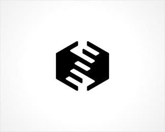
This is an idea of a symbol for Hatimeria - company producing dedicated software for various businesses (e.g. CRM systems). In general, they create programs that help to improve flow and management of data and information.
They would like to present themselves as a serious, stable and trustworthy player in the market. They would like to emphasize great dedication to understanding their clients` needs, resulting in products that "fit like a glove". Other business values we would like to stress is building long-lasting partnerships with customers and perpetual effort to improve.
I`ve started off with and idea of creating some abstract stairs graphic, which may be a bit of a cliche, however always nice and clear representation of "getting to the next level", improvement and so on. Later on I realised I can achieve this goal by combining two hands, which in turn could be a nice indication of close cooperation with clients.
I`m pretty happy with the symbol myself, but after having it shown to some "civilians" it turns out, that all of them get the hands-part, but only few can see the stairs.
I`m wondering what do you think about this symbol? Does it suit the short describtion shown above? What can you see in it? Do you think it is clear enough for "regular-people"?;-)
You can see the whole logo over here.
Comments more than welcome:-)
As seen on:
Hatimeria
Status:
Work in progress
Viewed:
7614
Share:

Lets Discuss
Great mark. I saw the stairs part first on this one and the hands are more evident on the other version.
ReplyI saw hand at first and stairs came second...but agree with fogra this is great.
ReplyThanks for your support Sean and Andrej! I really need it, cause I plan to force this design onto the client, whether he likes it or not%3B-)
Replyepic dude. epic
Replyseen something similar to this years ago... then tell a friend to stick a finger in it?...
ReplyThis logo is one of those, that make say, damn, why didn't I come up with something like this, great work!
ReplyReally nice mark, great work.
Reply%5Eyeah, really nice mark. Saw the stairs first, and yes, it fits the description.
Replyladny znaczek :)
ReplyI like the conceptualization of this mark. I am always a fan of hidden things. Would definitely like to see this taken into the coloring and effects stage along with the typography. The designer in me says %22AWESOME WORK BUDDY!%22 but the manager inside me says %22Now take it to the next level and finish this masterpiece!%22**Great Job and way to use your creative mind %3B-)
ReplyPlease login/signup to make a comment, registration is easy