Description:
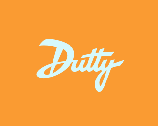
Frozen yogurt shop in Macau. At first, we had tried to go with something more gentle, smooth and subtle - to match yogurt`s creamy texture, but it turned out that the client prefers a heavier, less refined approach. This is a design based on client`s own sketch (surprise, surprise - it`s not bad!).
As seen on:
dutty
Status:
Client work
Viewed:
17658
Tags:
script
•
dutty
•
wordmark
•
handwriting
Share:



Lets Discuss
nice type work!
ReplyDajesz czadu z typo %3B)*
ReplyPo Dingole kolejne swietne typo
ReplyAwesome wordmark!
Replydobre typo
ReplyThanks all, but it was really my client who made a big part of the heavy lifting:-)
Replyjust perfect, love it.
ReplyExcellent type!
ReplyNice logo
ReplyNice letters
ReplyNice logotype. It might look better to have the type white instead of that light blue. The light blue/orange combo is a little off-putting for a frozen yogurt shop.
ReplyNice thick type!*I agree with @ocularink, light blue looks a bit strange.*Good luck!
Replyvery well
ReplyThanks for all the comments!**@ ocularink %26 balic*The light blue and orange combination is my client%60s choice - I also think that on its own it might not be the best match for a frozen yogurt shop. However, I have developed it into a full color palette, which, in my opinion, looks really nice, and should make up for this two-color version. *I have also tested the white-on-orange version and, in my view, it seems less interesting than the original. Although, I can easily understand why both of you feel like you do about the light blue version.*One way or the other, thanks for your input.
ReplyPlease login/signup to make a comment, registration is easy