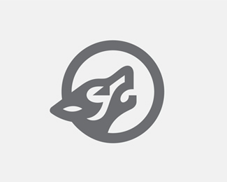
Description:
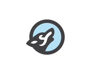
wolf
Status:
Work in progress
Viewed:
7641
Tags:
mark
•
logo
•
animal
•
wolf
Share:


Lets Discuss
Very cool mark George. if you don't mind me saying so, i think it could use some more thick and think lines.
ReplyIn other words too much black. Love it.
ReplyThanks Mike. I see what you mean. Input much appreciated.
Reply@milash your work is really nice! WOW!
ReplyAnother solid logo, George.
ReplyThanks Roy.
ReplyMateoto thanks
ReplyI love the simplicity of the single weight. I think adding thinner lines would add detail that would change the tone of the mark. imho
ReplyI love the simplicity of the single weight. I think adding thinner lines would add detail that would change the tone of the mark. imho
Replycongrats on the abduzeedo feature btw.
http://abduzeedo.com/logo-design-more-wolves?utm_source=feedburner&utm_medium=email&utm_campaign=Feed: abduzeedo (Abduzeedo Feed)
I like the this version better than the one with blue on it.
ReplyPlease login/signup to make a comment, registration is easy