Float
(Floaters:
32 )
Description:
Does it remind you of Unilever logo?
Status:
Client work
Viewed:
7483
Share:


Lets Discuss
more so than most, yes. just the pot on a string would probably be enough with that font. have you tried that?
ReplyIt reminds me of the V%26D logo the most (a Dutch department store) - http://org.vd.nl/upload/zoek/Content_Tree.gif
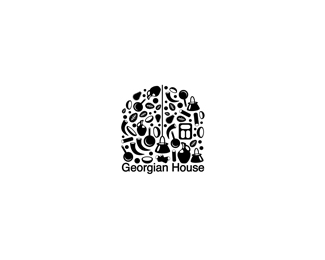
ReplyI have to show various traditional georgian household objects. I appreciate your idea.
ReplyYes, it is.
Replycool love these illustrative type logo's
ReplyI like it... there are probably many dozens of logos that use multiple images such as this within the design, I have done a couple myself, but there's always room for one more. Did you try the image with a roof shape at the top instead of the arch? Might make it more relevant to the name. Just a thought.
ReplyI actually did try the house. Arc is a very typical form for the georgian architecture, so it fits the concept. **thank you for suggestion and nice comments.
Replynice house. like it a lot.
Replythank you linza
Replyanother one that I like.
ReplyPlease login/signup to make a comment, registration is easy