Description:
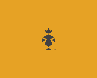
I've always wanted to make some approach on lion mark. It's a lion in a silhouette of a knight also.
Status:
Just for fun
Viewed:
7075
Share:


Lets Discuss
Is this legible?
Replyyes, for me it does, i can see them both. i've always share the same desire materialized in here %22http://logopond.com/gallery/detail/110055%22:http://logopond.com/gallery/detail/110055 maybe because i am born under this zodiacal sign, is that your reason too? :)
Replyoh, i forgot to mention the essential part, that it looks very good. my only doubt is related to the type, something seems like not working for me, but can't mention exactly what.
ReplyThanks for taking your time to make a comment (2). I'm sagittarius from zodiac sign. But I don't know I have things that I want to design from time to time, so whenever I have time I'm just doing it. Like yr approach also Alex. I think you're right about the type, will try to find something better.
ReplyMy pleasure. Sagittarius? I see. :) *I also like about your concept that you've combining 2 themes that i like: lions and knights. Looking forward for the type update then :)
ReplyThank you very much again AlexanderTass. I will let you know, stay tuned (:
ReplyI have taken off the type.
ReplyGreat mark, milou. Simple graphic yet Powerful. I like the color as well. Nicely done.
ReplyHey thank you Jippy, much appreciated!**Hey zu, I will see what I can do.
ReplyRoar.
ReplyTshshshsh.
ReplyVery nice mark! :)
ReplyThank you fine folk.
ReplyI like this and I like the colour, but I don't think the colour is the right one for lion and knigth. Do you know what a mean? Besides that it's great!
Replythis is a great mark mate, and i do agree with davishama, would look better in plain white bg. (or at least anything else than the bright pink.
Replynice.
ReplyDavi %26 Lecart - Thanks a lot pals. I agree with your points and will change the colors.**Hayes - Cheers!**Also I would like to add some type, what name do you suggest mates?
Replylion %26 knight, all in lowercase and dark grey. Maybe pt sans? Sorry if it sounds bad for you %3E.%3C
ReplyHey Fillipev, I guess I can try it, thanks. Any other ideas?
ReplyThank you AlenA.
ReplyBrilliant work!. I saw more of a lion before reading the comments and less of a knight... The lion though has an expression that i cannot describe. sort of like he is feelingless or in awe.. lol.. :)... maybe its just me but there is a pride feeling that a lion shows usually which I miss here. Just my two cents.
ReplyThank you for your thoughts fellas!
Replynice lion...
ReplyThanks again buddy!
Replyclever style and really nice execution... i really love it
ReplyPlease login/signup to make a comment, registration is easy