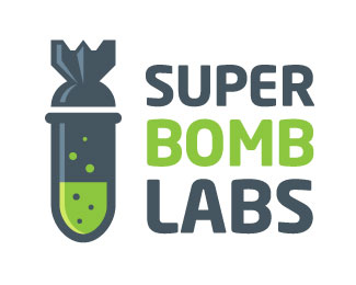
Description:
Logo for an interactive application consultancy. I knew that with an interesting company name like theirs it was a good opportunity to have a bit of fun with the identity and come up with something unique and memorable.
Status:
Nothing set
Viewed:
4122
Share:

Lets Discuss
Great highlights.
ReplyVery fun. The bottom curve of the test tube looks like it could be smoother though - unless that was done intentionally.
ReplyGreat mark, but the type isn't homogenous enough in my opinion. Know what i mean?*
ReplyGreat!%0D*I agree that you should work on type.
ReplyI mean the spaces between and inside the letters :)
ReplyReworked the type – let me know what you think
ReplyMuch better i think! The vertical spaces are still a little bit to big for my taste. Have you thought about coming up with a different type concept? **Still love the %22bomb%22 :)
ReplyThanks for the crit formrausch. The client specifically wants the type stacked like that next to the symbol so not much I can do about the vertical spacing :)
ReplyPlease login/signup to make a comment, registration is easy