Float
(Floaters:
109 )
Description:
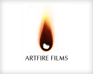
logo for artfire film production agency
Status:
Nothing set
Viewed:
40643
Share:
Lets Discuss
are you sure you used the template? this looks distorted (text)
ReplyWow, this is stunning.
ReplyTnx*I will fix that font distortion.*and hole in fire will be actually cut out on any printed application*
ReplyI'm loving it, but the major concern I have is how it will reproduce on darker background? Film logos are are almost always on darker backgrounds and the whole paper effect will be lost. But it is impressive for print.
Replyvery cool idea and nice execution.
ReplyYes I thought about that as well. Red and yellow colors will be more intensive for black background preparing. But its true, it does work better on white.
ReplyAwesome!!
Replybeautiful ... i cant really see any problems with this whether in black and white or on a dark background ... can see it really popping on a dark background ... nice .... and wow
Replyit's good even with the distortion, the first time I saw it I actually thought that the text was burned up
ReplyNice one man.
Reply@ kaimere, it's a burnt effect how can it work on black? half of the effect is black, it is not a flame it's a burnt mark and that was my concern. I guess you could always add a white piece of paper (square) around the mark. I do think it's fantastic just making a real reproduction issue that's all.
Reply@logomotive ... i'll place money it'll work ... just saying :) I have seen ideas in the same vein work on black ... not a huge leap ....
ReplyHa, I see you have %22money to burn%22 (joke) hey I'm just saying this mark relies on MATTER in this case the paper. How's it going to work say on film screen? I guess I would have to see it to take your word humm. This is somewhat of the same challenge I have been up against with my ice logo where it's dependant on the background (transparency).Anhow it WORKS AWESOME here. nuff said.
Replyheheh ill be burning your cash :) the only reason i say it'll be easy is ... mines not in the same league ... but tangerine is of the same ilk :) ...**I can tell ya how to get the transparent one to work too :)
Replyim kinda backin kaimere on this.. so dont burn all his cash dude.. want half%3B)... in this day %26 age guys.. even black would print well on black!!! if you know what i mean.. anyway... as for the film screen.. as an animated version this would be awsome!!!
ReplyThis rocks! What don't you guys put this in the gallery already!!!!
ReplyIm in the money, im in the money loooool ... just kidding ... looks good.... again great logo
ReplyOnce again thanks for comments - all of them :) *Version without jagged text is reuploaded.*I was aware of the black-background-problem, but client liked idea a lot.*For the black background logo will be modified - red and yellow will be more contrasted and there will not be cut out hole in the middle (we still preparing that version).**
ReplyNice concept and very good execution.**And it bothers me that your logo reminds me of %3Ca href%3D%22http://www.burela.org/imagenes/torneo/burn.jpg%22%3Eburn energy drink%3C/a%3E because I really like what you've created here.
Replywell then,.. I hate it when I'm wrong (not very often)ha ha . Kaimere whats your bank route number? LOL
Reply@Art Machine: I think that other logo is not close at all. Yeah, the energy drink logo is a flame, How many logos have flames? Also, this one is more of the burnt residue left over from the flame.**Mireldy, I've got your back! People get very critical one here...but that's usually a good thing.**Mike (logomotive)...way to be a good sport.*
ReplyI agree with you ahab, this logo is very well done and indeed is not close to the **burn** logo and that's why I said it bothered me to be reminded of the energy drink's logo. *Mireldy's logo is beautiful. : )
Replygotcha
Replyhehehe virtual beers on you logomotive :)
Replythis is hot
Replyimpressive. and the original is in vector format?
ReplyWhoa!...this is nice.
ReplyIt's beautiful, but how could you use them into print?
ReplyThis design is freakin' sweet. It is one of those, %22damn I wish I thought of that%22 designs. Nice work.
ReplyThanks for your comments. I really appreciate it
ReplyI'm just in awe. And I love how you'll actually %22burn%22 through the paper when it's printed. Very thoughtful!!
ReplyBeautiful design. May I ask what font that is?
Replythis is totally awesome! I'm not convinced on the black, but i think you could make it work by just adding it to a scrap of brown paper or something like that. I think you need it to look like it's actually burnt something and the flat black doesnt really give that to me.**Awesome work!
Replywow - its cool!
ReplyBeautiful design. I can think of several ways you could make minor alterations to work on black or dark backgrounds. Great, creative solution.
Replyhot!
ReplyIt's a scorcher. How does it work on a dark background. LOL!
ReplyCestitke za nagradu :)*odlican je logo
ReplyRaja cestitam vam na osvojenoj nagradi! Pozdrav iz SA :)
Replyej hvala vam:)*tek sad smo vidjeli komentare
ReplyI caught this on the intro to PaperMan .. the animation and logo are stunning ... truly great work ... works soooo well
Replyh e l l !
Replyhahhaha , amazing one !
ReplyStunning!!!
ReplyBeautiful design!
ReplyGlad to you posting again!
ReplyPlease login/signup to make a comment, registration is easy