Description:
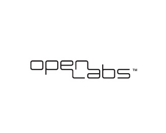
Wordmark for a series of electronic music workshops. Approved version.
As seen on:
Status:
Client work
Viewed:
3467
Share:

Lets Discuss
I agree, this is a well thought out logotype. I especially like the %22open%22 area created by the N and L.
Replyvery nice!
Replythanks for the comments :)
Replybeautiful piece
ReplyVery well done!
Replycheers. The type is custom, and it's being used now for the workshops.
Replyi like this. Excellent design!
ReplyVERY good... love the open space created!
Replylove it!
ReplyIt would be awesome if there%60s some subtle test tube or such in those negative spaces.. was looking for it.. :)
ReplyThis is great looking MJ.
ReplyPlease login/signup to make a comment, registration is easy