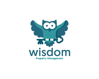
Description:
[email protected]
Status:
Unused proposal
Viewed:
2200
Tags:
•
property
•
key
•
wisdom
Share:


Lets Discuss
lacking few refinements here and there, but overall very nice!
ReplyYes you are right. Its one month old design. Now that i look at it again i dont like the little hole between the wing and the key. What else? appreciate your feedback! :)
ReplyBesides the key, you could lighten the body of the owl to give it more contrast, the colors are blending for me. Very impressive otherwise. Good job :)
ReplyPlease login/signup to make a comment, registration is easy