Description:
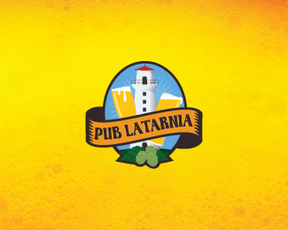
Pub Latarnia - small pub in port city.
As seen on:
logo
Status:
Nothing set
Viewed:
4936
Share:




Lets Discuss
Ciekawe!
ReplyDzieki Milosz!
ReplyLove the style, nice work!!
ReplyThanks Luis :)
ReplyBright, origin, good sign!
ReplyBeaut.
ReplyThanks Alen and Sam! :)
Replyvery nice ... cool illu
ReplyThis is fantastic. I think the illustration and the text banner are not similar enough in style. Maybe try the banner in less of a woodcut style, something more illustrative like the lighthouse. Maybe even rethink the black stroke. Great job!
Reply%5EI agree. I like both the lighthouse illustration and the scroll, but not together. The styles are incongruous. And to be quite honest, as much as I appreciate the detail of the illustration, I feel like the style of the scroll is what you should be striving for, overall. That element feels way more pub-like to me than the background elements. I would think about trying to figure out a way of simplifying your forms so that they match the aesthetics of your scroll: stroke-heavy, hatched shading, high-contrast, etc.**Keep pushing this one. I think you're on the verge of a really successful mark if you can somehow unify your conflicting styles.
ReplyAnyway, I have been attracted on the first sight!
Replybeautiful illustration, nice work.
Replyoooh...really nice one.
ReplyI like the style, but the beer seem like the letter V.
ReplyPlease login/signup to make a comment, registration is easy