Foster
by mucho • Uploaded: May. 02 '08 - Gallerized: May. '08
Float
(Floaters:
31 )
Description:
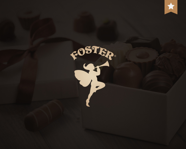
Logo redesign for a chocolate fortune candies.
Status:
Client work
Viewed:
9,357
Share:



Lets Discuss
I'm wondering if this logo would be more effective all on one line. Something about the curve on the type seems off. Even so, another great logo. :-)
Replywell, let me not agree %3B) - here we have a %22fairy%22 atmosphere and this must be shown in some not so traditional composition
ReplyI still think the type looks funny on a curve. %3B-)
Replyit is your right :) ... different ppl different tastes
ReplyI like the text on a curve. But the type needs adjustment so the curve is properly curvacious. After the letter T the visual curve created by the letters T, E, %26 R takes a sharp turn south and makes the curve feel awkward.**I would also try tying in the text with the horn a bit so you get a sense of Foster as music played by the nymph.
Reply@ mucho : The logo is great and it has lots of character. I'm just being nit-picky. You're obviously a very talented designer. :-) If you take some of grubedoo's points into consideration, this would be even better. Best regards.**
Reply10x guys, i promise as soon as possible to check put your advises %3B)
ReplyType and illustration work great together.
Replylove the type! nice colours aswell
ReplyGreat, mark and type are just right
ReplyPlease login/signup to make a comment, registration is easy