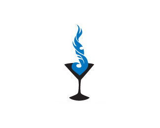
Float
(Floaters:
4 )
Description:
music, note, cocktail, fire
Status:
Just for fun
Viewed:
3881
Share:

Lets Discuss
pretty cool mark muse7. not so sure about the hexagon ice cubes. i know that music notes can be in that orientation, but how about right side for more familiarity?
Replygyui, thanks for stopping by and commenting. You made my day. The music note's orientation solidifies the visual tie between the music note's tail shape and the flame. I think if I flipped it, the connection would lose some of its impact. As for the ice cubes they tie into the primary Fire %26 Ice logo but squares would work as well.
ReplyNice. I'd like to see the music note integrated a bit more subtle. Those top two licks of flame already look like the top par of a note. Nice.
Replylogoboom, Thanks for stopping by and commenting. So you are saying delete the top flame and replace it with the note?
ReplyJust seems like there's opportunity to lose the literal note...and turn those two flame licks into the top of a more stylized note. The note itself might follow that implied white line of the curve down and then sit as a neg space oval in the appropriate place knocked out of the middle flame. Maybe if you play with it?
ReplyIf that doesn't make sense I can email you a rough of what I'm talking about on top of your image if you like. Don't want to overstep but it could be cool!
Replyok logoboom - not quite following email: [email protected]
Replysent
Replythe position of the mark is quite nicer here as well, i think altogether this version has more dinamism, My thoughts is you should keep this, just work on the placement of the note :) oh, and the sqare cubes :P**I'm liking it a lot!
ReplyPlease login/signup to make a comment, registration is easy