Description:
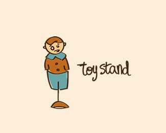
toy shop logo for picky kids. a toy, vintage style, on a hat-stand. the expression is typical, trying to achive a memorable character. custom type.
feedback is welcome.
thanks.
As seen on:
-
Status:
Just for fun
Viewed:
1397
Share:

Lets Discuss
i love the figurine illy but the stand is awkward...don't know if it's the placement...the look of it...or me.
Replythanks frank. yes, i feel the same. maybe the stand is not the best for it:p
Replyi came back to this and revised it but i wasn't pleased. as a matter of fact, the first idea is that this is a bit raised from the ground, that bottom of the stand is facing towards, i belive that it gives more depth to the figurine:p
ReplyPlease login/signup to make a comment, registration is easy