Description:
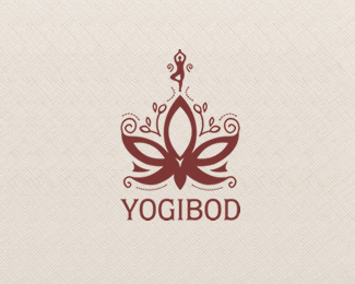
Logo for a yoga company. feedback welcome. thanks.
As seen on:
-
Status:
Client work
Viewed:
1118
Share:


Lets Discuss
Mmm... very good.
ReplyI like the little person atop. Maybe more balance of thick and thins on the mark. The ....dots will get lost perhaps make them lines.??
ReplyMaybe make the person larger and reduce the overall mark, will help convey Body more.
Replyhmm, you're right about all of these, Mike. but my client wanted crazy things (you can hardly guess:p)and this version is the best solution. i want change a lot now, and yes, the dots perhaps, the pose...but since this is final..
ReplyThis is really nice. I could see some of the changes mentioned above.
ReplyPlease login/signup to make a comment, registration is easy