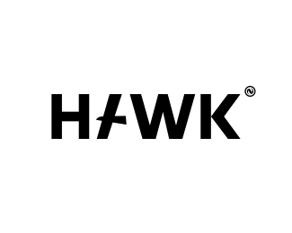
Description:
invisible hawk..)
Status:
Work in progress
Viewed:
10887
Tags:
•
lettering
•
bird
•
hawk
Share:


Lets Discuss
Has potential. Does remind me a bit of the Old B of A logo though. Think the type needs more 'flare' to make it work.
ReplyNice solution for including the bird. Clever.
ReplyGreat concept!
ReplyExciting...
ReplyI agree with Mike.
Replythe concept is nice, but not for the typo.
ReplyMany thanks guys you for your criticism, I do not understood what Mike said)) but it was very interesting to learn.
ReplyAnd thanks a lot all swimmers!
He was saying it reminds him of this logo
Replyhttp://www.brandsoftheworld.com/sites/default/files/styles/logo-thumbnail/public/0000/0820/brand.gif
Great logo!!! :)
ReplyI love how you incorporated the hawk into the A!
ReplyThis logo is killing it on Pinterest.
ReplyPlease login/signup to make a comment, registration is easy