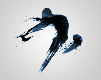
Description:
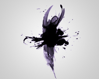
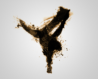
Originally for an online dance school, the client dropped the project entirely before typography had been finalized.(probably because the name he'd chosen was so crappy...). Anyway, the initial idea was to combine the idea of traditional art (paint) and make it dance. There were three dancers created - ballet, breakdancer, and interprative (seen here)
© 2011 Nathan Trafford
Status:
Unused proposal
Viewed:
30936
Share:


Lets Discuss
This is brill!!
Reply%5EDitto. Great work.
ReplyThis is worth pursuing regardless of the client dropping it. I like the set -- would be awesome to post on a wall as a triptych.
Replywonderful motion in this.
ReplyAwesome work!
ReplyGreat movement and execution. This is strong.
ReplyAwesome! Great work
ReplyGreat painting!
Replyamazing work
ReplyThe whole set is fantastic, this is my fav!
Replylot of energy with minimal strokes. love it. great style.
Replythanks for the nice words!**if i were to flesh it out,*any ideas for a company name that would complement it?
ReplyblINK
Reply%22New Delhi Paint Dancers Federation%22...**either way.. spectacular set.. of designs, that is.
ReplyVery very nice
Replythanks! and thanks for all the floats! i'll get round to giving them type one of these days.
ReplyWow,this is cool , very nice.
ReplyAMAZING ART!!
ReplySpectacular indeed!!!!
ReplyI love the feel of it, just not sure about the abstract object in the front, maybe I'm missing something here?
Reply%5E That's the front left knee. The right leg is back and straight, the left leg is bent and knee is raised upward.
Reply%5Every good, sean %3B)
ReplySuperb! Very artistic
ReplyDuh! I just saw it at first as 2 legs back kinda like a Swan dive! and wondered what that object was :) My bad.
ReplySwan Dive http://www.youtube.com/watch?v%3DuLTIowBF0kE
Reply%5E bahahaha! i flippin LOVE old spice commercials!
ReplyReally, this is absolutely stunning... it's a shame that your client didn't see what was here. This is beautiful and I hope that a client with better taste snaps this up in the future. :) I would frame this and have it on my wall!!! Let me know if you're going to sell prints. %3B-) The 3 would be a very nice series.
ReplyGreat set congratz, a lot of emotional charge here
ReplyWOW!!!! Beautiful!!!
ReplyI've been meaning to comment on these. Great work, Nathan. Very artistic, and very inspiring. These really push the boundaries of what most would consider logo design. It's a shame your client was so lame, but as we all know, some of our best work often goes unused. Regardless, these are great portfolio fodder for sure. You should be very proud of this set. I'm assuming these were created organically and then scanned and vectorized?
ReplyThankya! Quite the process here. Started when i had pencil lead on my fingertip. I'm lazy so instead of washing my hand i wiped it a few times on the nearest piece of paper. Looked over at the paper later on and the markings were in almost the exact shape of this current logo. Stored this in my (little) brain, and then a few years later i'm using this gestural shape for the logo. drew it out with pencil a number of times (all on 8.5x11) til the shape was right. Scan and print a bunch of them. Paint, splatter, smear, etc a bunch of different times. Scan all of em. Combine in photoshop, picking and choosing the best combos. Cheat and add some photoshop brushes. Colorize, vectorize, jazzercise, logosized.
ReplyThat's awesome. Thanks for sharing your process. I love how sometimes great ideas are born from the most innocuous circumstances.
ReplyThe whole set is fantastic, this is my fav!
ReplyMan your graphics are great!!!!!!!! congrats!!!
ReplyThis is absolutely breathtaking. I know this is old and you may not still check this site but I would love to use this design. Is it available?
ReplyBeautiful illustration!
ReplyAmazing! nothing else to say!
Reply@nathantrafford how can I buy this?
Reply@nathantrafford .. love this design and would like to use it. How do i proceed?
ReplyPlease login/signup to make a comment, registration is easy