

Description:
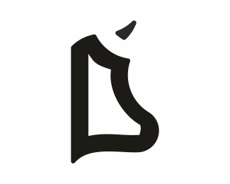
This is graphic part of logo and I need your thoughts on this work in progress.
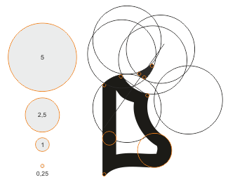
Logo is still proposal. Logo construction is on second image.
Main goal of this small family company is eco grassfed cow farming.
is cow recognizable at first look?
is visible subtle letter D?
Any idea or critique is welcome
Thx
Status:
Unused proposal
Viewed:
1103
Tags:
cow
•
head
•
cow
Share:

Lets Discuss
Hmmmm... I don't see the cow or the D unfortunately.
ReplyD: no way. Cow head: I see it, but I think it's a stretch. All those circles: really?
ReplyWhat's up with the circles these days?
ReplyLife is a circle, man.
ReplyI like in some concepts to use circles, because with them symbol looks as simple as possible. Here for example you can see why horn is placed there. Also symbol proportions are in golden ratio.
ReplyMaybe is too much math behind this solution, and lack of visual integrity.
Thank you all for comment... After clients feedback, I'll send next version.
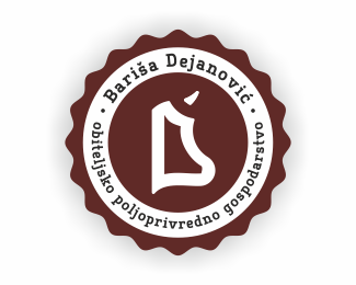
Also would like to hear your opinion on symbol implementation.
Please login/signup to make a comment, registration is easy