Float
(Floaters:
47 )
Description:
wip...is an up & coming website that provides services to the gaming community...
Status:
Nothing set
Viewed:
7204
Share:


Lets Discuss
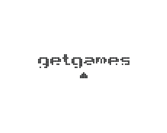
This is nice, it takes me back in time whens I was big player of computer games :-) Space invaders getgames logo, superb concept.
ReplyI agree this is great...love the damaged letters.
ReplyAhh, nostalgia. Nice one Nav.
Replynice one dude :)
Reply2 da old skool, nido! cool %26 clever :)))
Replythanks fellas!... old skool indeed %3B)
Reply...oh %26 out of curiosity... do you think that this may imply any negativity upon the brand?.. the words being %22shot%22 at %26 the name being %22destroyed%22???.. I would really like to hear your thoughts on this.. many thanks.
ReplyNo you need to damage the letters to shoot the aliens, unless the letters are the aliens or the barriers you hide behind either way it helps you kill the aliens to get to the next level.
Replyhaha.. thanks cerise...
ReplyNav, really clever idea and execution. I buy it but def has the 80's feel which I think is cool. How do your clients feel about that? I like it and think it's a great logo and concept.
ReplyCheers Mike... yeah the 80's issue has been raised... they feeling that the younger audience wont %22get it%22... along with the afore mentioned %22problem%22 of the name being %22destroyed%22... may need to look into some other possible avenue...
ReplyHow about a couple of g's in the shape of a games controller/joypad?
ReplyWhile it has that 80s nostalgia to it, it doesn't feel all that 80s to me. I like the overall style and consider it a tribute to gaming. Great one, dude.
ReplyThis is awesome!
ReplyTrust me the younger generation will get it.
ReplyA client would be silly not to take this one!
Replynice !!
ReplyReally nice, playful and well executed! i miss the spaceship shooting a bullet though.
Replythanks fellas.. yeah i intentionally left the bullet out as it looked awkward seeing as its two pixels joined forming a rectangular object which set the whole thing off....
Replymake sense
Replythanks once again... this logo was accepted %26 signed off today!.. :)
ReplyCongrats Nido, really great work!
Reply%22this logo was accepted %26 signed off today!%22**...and he did it without the use of cheat codes :P
Replyfun typographic solution.
Replyexcellent
ReplyStrong concept and very nice execution. I really like this nido.
Replythanks every type08, typographics, ru_ferret %26 !mude... you all have really cool names!**lol@ Hayes...
Replythanks type08, typographics, ru_ferret %26 !mude... you all have really cool names!**lol@ Hayes...
Replythanks type08, typographics, ru_ferret %26 mude... you all have really cool names!**lol@ Hayes...
Replyfinally got it right...
Reply%26 now im all over the comments page... yeah everybody look at me.. woohoo!...
Reply... and I realised that tomorrow I wont be... **so look for me on page 4... woohoo!....
ReplyLets bring you back to page 1...as this rightly belongs there!
ReplyMissed this! This is awesome. Nothing negative about destroying the name in this case. It's integral and appropriate.
ReplyI'd like to see this in color. Nice type treatment, nido.
ReplyIt's nice. You need to stop using Cocon so much though.
Replythanks guys...**@garry... hey %22funny guy%22.. you'll be spending the rest of your life in 'cocon' you don't zip it.. %3B)
ReplyPlease login/signup to make a comment, registration is easy