Description:
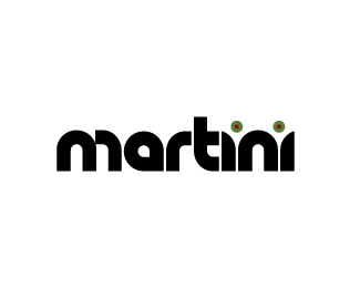
Just playing around with text, but I guess it could be a bar or martini mix logo. Not only do the dots in the i's make olives but the glasses appear in the negative space.
Status:
Just for fun
Viewed:
2339
Share:
Lets Discuss
awesome!
ReplyVery cool. Why is M that way though ?
Replywell just looked too wide of a letter as a double hump, so i just played with it and sorta liked it visually with the m like this. it also repeats the r shape reversed much like the reverse arcs in the i's.
Replyjust noticed this. great concept! i think the type is too heavy and takes away from the hidden glasses. Even though they are to be discreet, i think this a more complimentary typeface will put this over the top! This is a remarkable logo which can be taken to the next level with some more experimenting with different typefaces that will compliment the hidden mark, not compete with it.
Replythanks so much for the positive feed back from all! will most def play around more with the concept.
ReplyThat's a nice result!
ReplyPlease login/signup to make a comment, registration is easy